Digital technology and art museums don’t always seem like a natural fit, but within the Digital Infrastructure and Emerging Technology (DIET) department it’s a perfect match. We ask a lot of “what if ” questions in DIET: What if all of the Harvard Art Museums’ object information could fit into the palm of your hand? What if the collections were represented as universes and solar systems? What if you could walk around in a virtual storeroom of art that extended endlessly in three-dimensional space? What if the museums’ data were accessible to any other programmer who is asking his or her own “what if ” questions?
To help answer these kinds of questions and try to create a richer museum experience, DIET has been experimenting with such technologies as touch- and gesture-based devices, data visualization software, and data management tools.
Fifty-six percent of American adults are now smartphone owners (Smith 2013), and we anticipate that this percentage is even higher among museumgoers. For that reason touch-based smartphones seemed like a logical place to start exploring. Through experiments we learned that technology-driven experiences are about balancing the interplay of hardware, software, data, and environment.
From January to June 2013 we tested the augmented reality application Layar within the exhibition In Harmony: The Norma Jean Calderwood Collection of Islamic Art. With the app, visitors could access multimedia content on their own (or borrowed) mobile device while in the galleries. Layar’s main way of interacting with the world is through image recognition, which taught us a lot about the capabilities of different smartphone/tablet cameras and how the low light in galleries impacts image recognition. We got valuable practice in developing guided but nonlinear museum experiences. And we learned about the need to balance design and functionality to deliver a satisfying user experience.
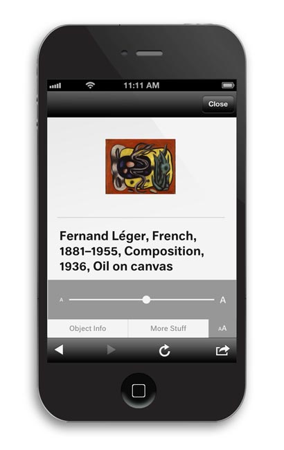
Our second experiment was designing a digital equivalent of printed wall labels. A few years back we had considered electronic paper, a display technology (also used in e-readers) that mimics the look of ink on paper as an alternative to traditionally printed labels. The ability to change label content from a remote computer was very appealing, but we couldn’t change the color of the e-paper to match the walls. So we went back to work. In May we tried another strategy to deliver labels: we developed a mobile-friendly website that mirrors the design of a wall label, proving we could deliver labels to mobile devices through the Web.
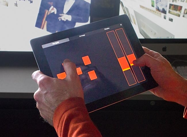
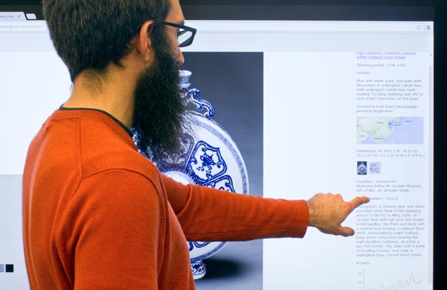
To further test how far technology can go in connecting more people to more art, we recently started asking ourselves if we could develop a virtual environment for our storerooms, granting users uninhibited access to the full depth and breadth of our collections. Using what’s called Processing (a programming tool for graphical applications) and data from our collections database, we built a 3D virtual storeroom. The user experience is quite simple. The storeroom is presented on a large LCD screen and an iPad is the controller. The iPad controls give the user six degrees of freedom. Users can walk down rows of works of art, fly on top of them all, zoom in and look at individual works, then step back to view the whole of the collections. The user is free to sort and group objects on the fly. The works are shown to scale to give a real sense of the size and shape of the collections. This prototype taught us a lot about the malleability of our data and its ability to be visualized in new and exciting ways.
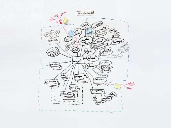
All of these efforts highlighted the need to adjust how our collections data is organized and accessed. If our data is to flow to such a diverse set of technologies we realized it would make the most sense to centralize the way we manipulate and access that data. We therefore developed an application programming interface (API) that opens up access to information about our works of art and the people, places, exhibitions, and publications associated with them. With the API in hand and the experience gained from our digital projects, we have started to model the “create once, publish everywhere” (COPE) principal, which will be used to bring our future projects to life.
Digital technology can be a powerful way to connect museum users with deeper content and meaningful experiences within the galleries’ walls and virtually anywhere in the world. It has the power to open up a dialogue that enhances our shared understanding of the museum experience. We in DIET will continue experimenting and creating tools that help keep this important conversation going.
Smith, Aaron, “Smartphone Ownership 2013,” Pew Internet, June 5, 2013.


