Multi-layered: Louis Delsarte’s Color Separations

By Christina Taylor, Georgina Rayner
May 12, 2022
Index Magazine

Multi-layered: Louis Delsarte’s Color Separations

This print shows a woman holding a child and seated on a chair in a living room with her family gathered around her.
2018.33.5 Louis Delsarte’s photolithograph Unity (1995) is a print made of many overlapping color layers. Offset lithograph on white wove paper. Harvard Art Museums/Fogg Museum, Margaret Fisher Fund, 2018.33.5. © Estate of Louis Delsarte.

The exhibition Prints from the Brandywine Workshop and Archives features the impressive photolithograph Unity, by Brooklyn-born painter and muralist Louis Delsarte (1944–2020).

The Harvard Art Museums recently acquired the lithograph, along with an exciting and rare group of 12 drawings on plastic sheets, called color separations, that the artist used to make the print. A conservator and conservation scientist teamed up to discover what the color separations reveal about Delsarte’s process. Artists do not typically retain color separations after their print is complete; much like printing plates, the sheets are often seen as means to an end. Thus, having access to these color separations is an excellent opportunity to deeply examine them to see what we can learn about Delsarte’s materials and techniques.

What Is a Photolithograph and How Is It Made?

A traditional lithograph is made by drawing an image directly on a plate or stone. A photolithograph differs by transferring the image to a plate through a photographic process. The image is exposed to a plate that has been coated with a photosensitive material that will permanently fix the image to the surface when developed. After the images are complete, the printing process is the same for both traditional lithographs and photolithographs.

To make a photolithograph, an artist creates their drawing or image on a transparent or translucent film. It’s done this way because during the exposure process, light needs to pass through the film—much like a photographic negative—to react with the photosensitive material on the plate. The opacity of the drawing media an artist chooses is very important. Media that are opaque will block the most light and will ultimately print very dark; media that are more gradated or faintly applied will result in more tonal or lighter passages in the print.

Once the artist completes the drawing, the film is placed in contact with the photolithographic plate and exposed to light. The plate is then developed in a chemical solution that dissolves the areas that were exposed, and the material remaining on the plate is a duplication of the artist’s drawing. When printing, the ink (which can be any color) will stick to the material on the plate and transfer to the paper when run through the printing press.

Reproducing Delsarte’s Methods

To illustrate the steps of the photolithographic process, I (Christina) created a mock-up using some of Delsarte’s techniques. First, I made the image on translucent film with materials such as ink washes, pen and pencil marks, and collaged strips. Then I exposed that positive image to the photolithographic plate and developed the image with a chemical solution. After the plate was developed, the green emulsion remaining on the aluminum lithographic plate duplicated the original image on translucent film. Finally, the plate was inked and printed in red. Most prints are reversed when printing, but Delsarte’s photolithographs were printed on an offset press, which reverses the image twice. The orientation of the artist’s drawing, plate, and final print, therefore, are all the same.

What Are Color Separations?

Common among almost all forms of color printmaking is the need to separate the individual colors in an image before printing. The separated layers are each printed in a singular color, which build up to the final color image. The term “color separation” is often associated with commercial printing, where images are separated into four layers: cyan, magenta, yellow, and black, or CMYK. Delsarte did not separate by CMYK, but instead used a unique and specific color palette to achieve his rich and layered print.

At the bottom right corner of each of Delsarte’s color separations is either a pasted color swatch or a written description that indicates in which color that layer was printed. One of the separations, shown below, has a notation that it was printed in Rhodamine red, for instance, which can be seen in the corresponding areas when compared with a detail of the print. This is especially clear in the area of the red dress. Each of Delsarte’s 12 color separations was exposed to its own plate and corresponds to one of the colors layered in the final print.

Delsarte’s Working Methods

Delsarte worked closely with Allan Edmunds, founder of the Brandywine Workshop and Archives in Philadelphia, to create Unity. Because many aspects of color photolithography are very technical, artists often rely on master printers to help transform their artistic vision into a final print.

Delsarte used a variety of materials and techniques to create his color separations. Usually he opted for black ink washes applied with a brush, black pens, and graphite pencils, but he also incorporated collage elements and reductive techniques, such as scraping and wiping. He approached his drawings on the separations in a very painterly fashion. In some areas, he applied multiple washes of ink to create variation in tone. In others, he blotted ink with paper towels or cloth to add texture. Depending on the color he ultimately wanted to print, some of the separations he worked very heavily with many layers of different media, whereas others he left much sparser.

The color of the drawing materials Delsarte used to make the separations had no effect on the color that ultimately was printed; it was the opacity of the materials and how much light was blocked or allowed to pass through that Delsarte was considering when making his color separations. He used mostly black drawing materials because black is typically the most effective at blocking out light. The orange plastic strips he pasted on are an opaque plastic, so they were also very effective light blockers during the plate exposure process.

To ensure that all of Delsarte’s layers aligned perfectly during printing, Allan Edmunds prepared each plastic sheet by punching holes through stiff plastic reinforcements at the top and bottom edges. To see how the layers interacted with one another as he worked, Delsarte placed the translucent sheets through large metal pins (see the second image in the slideshow below), so that each of the separations was perfectly aligned with one another as he worked on and drew them.

Analysis of Plastics

Plastics represent one of the most fragile materials in a museum collection. They were never designed to last forever, and they will degrade over time. It is important for museums to know what plastics are present in their collection, because while degradation cannot be stopped, it can be slowed, preserving the plastic for longer.

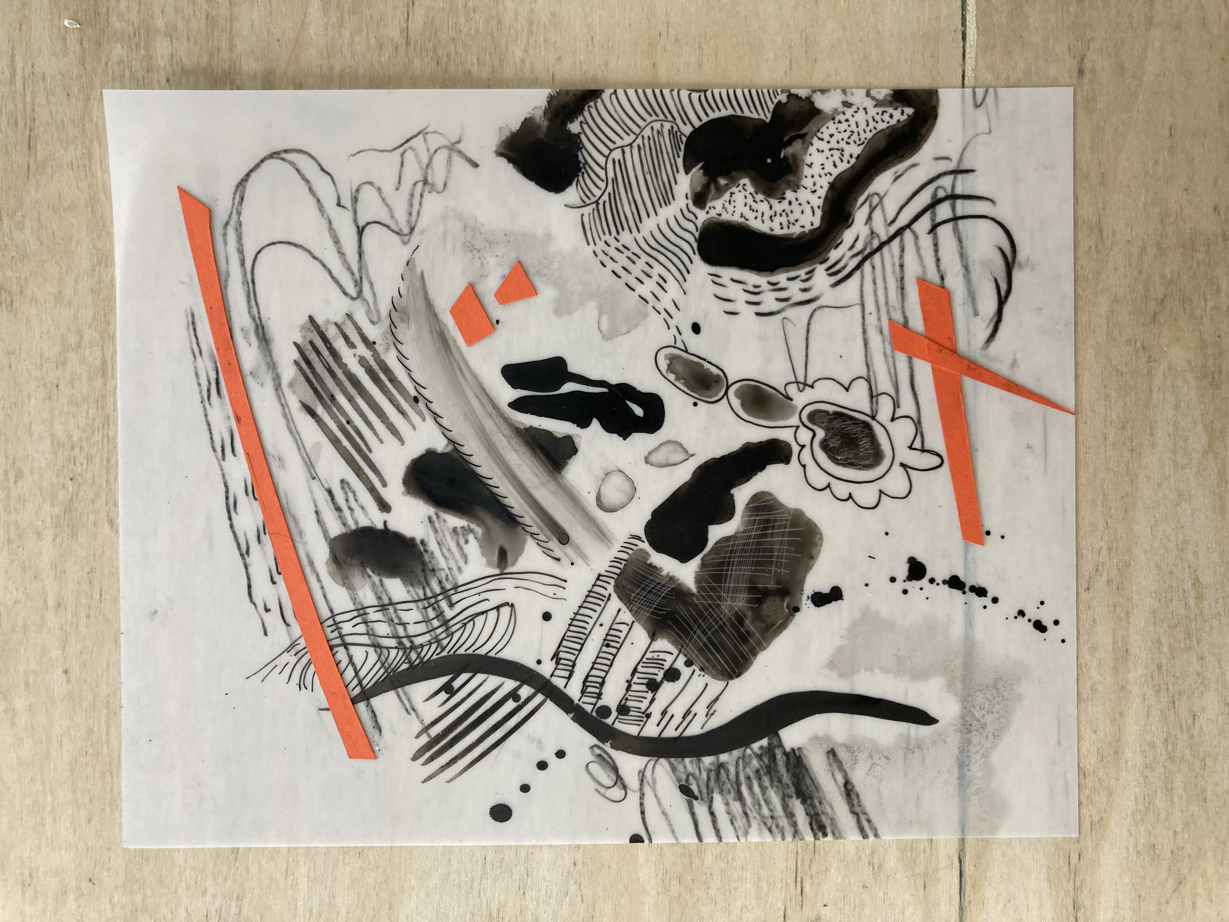
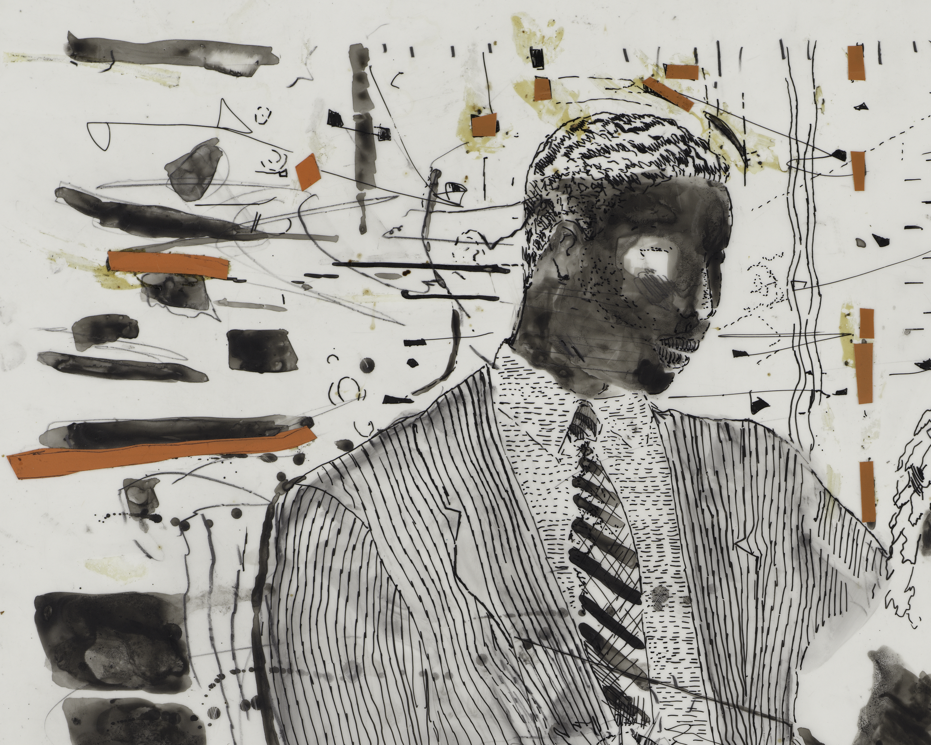
It is very difficult to know what objects contain plastic without conducting scientific analysis. Thankfully, this is possible in the Straus Center for Conservation and Technical Studies, where a particular focus recently has been the identification of plastics throughout the collections. Analysis requires a sample, which is very small, about the size of a grain of sand. It was decided, in consultation with exhibition curator Elizabeth Rudy, that it was important to take samples to identify the plastic components of Delsarte’s separations so that the museums can continue to care for them in the best way possible.

Analysis revealed that the plastic sheets are made of poly(ethylene terephthalate), abbreviated to PET, and commonly known as Mylar. There is a thin coating on the surface of the plastic sheets that contains a mixture of poly(methyl methacrylate), often shortened to PMMA and commonly known by its commercial names such as Plexiglas or Perspex, mixed with silica. This coating gives the plastic sheet a matte surface on which the drawing materials have been applied. Both PET and PMMA are two of the more stable plastics, meaning that they degrade relatively slowly in comparison to other plastics and are more resistant to yellowing, a common observation of aged plastic.

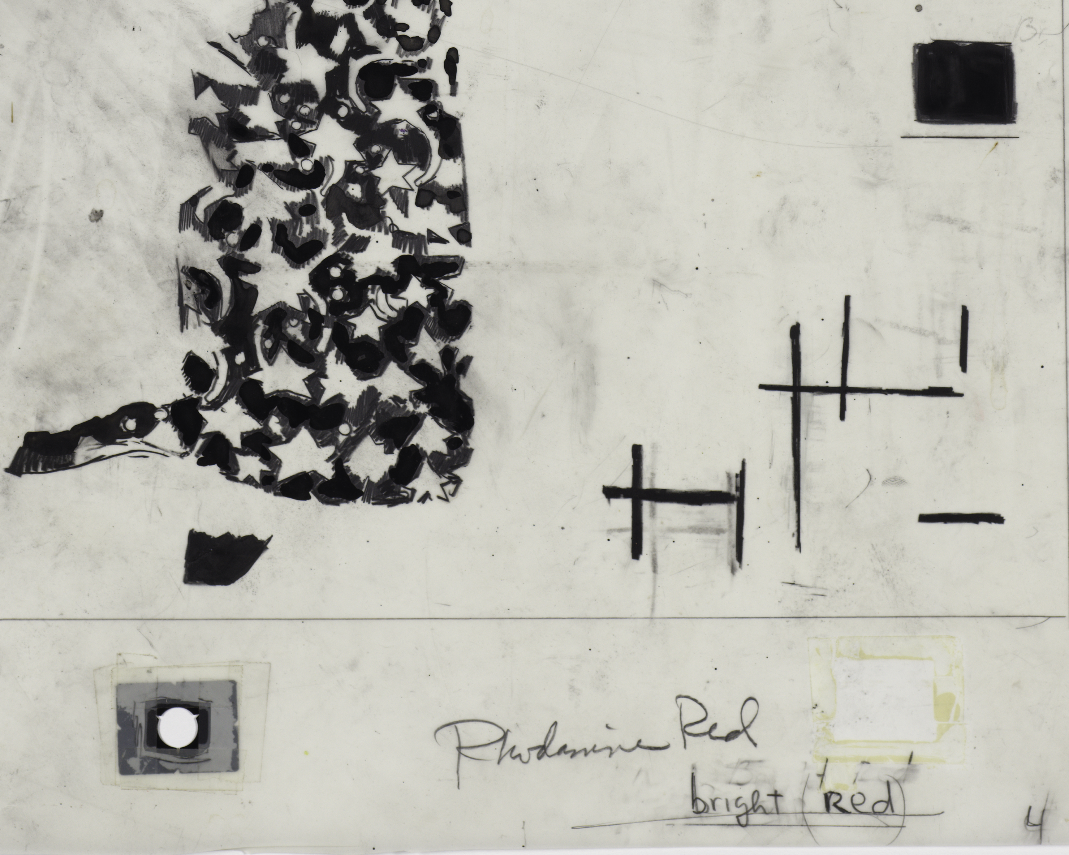
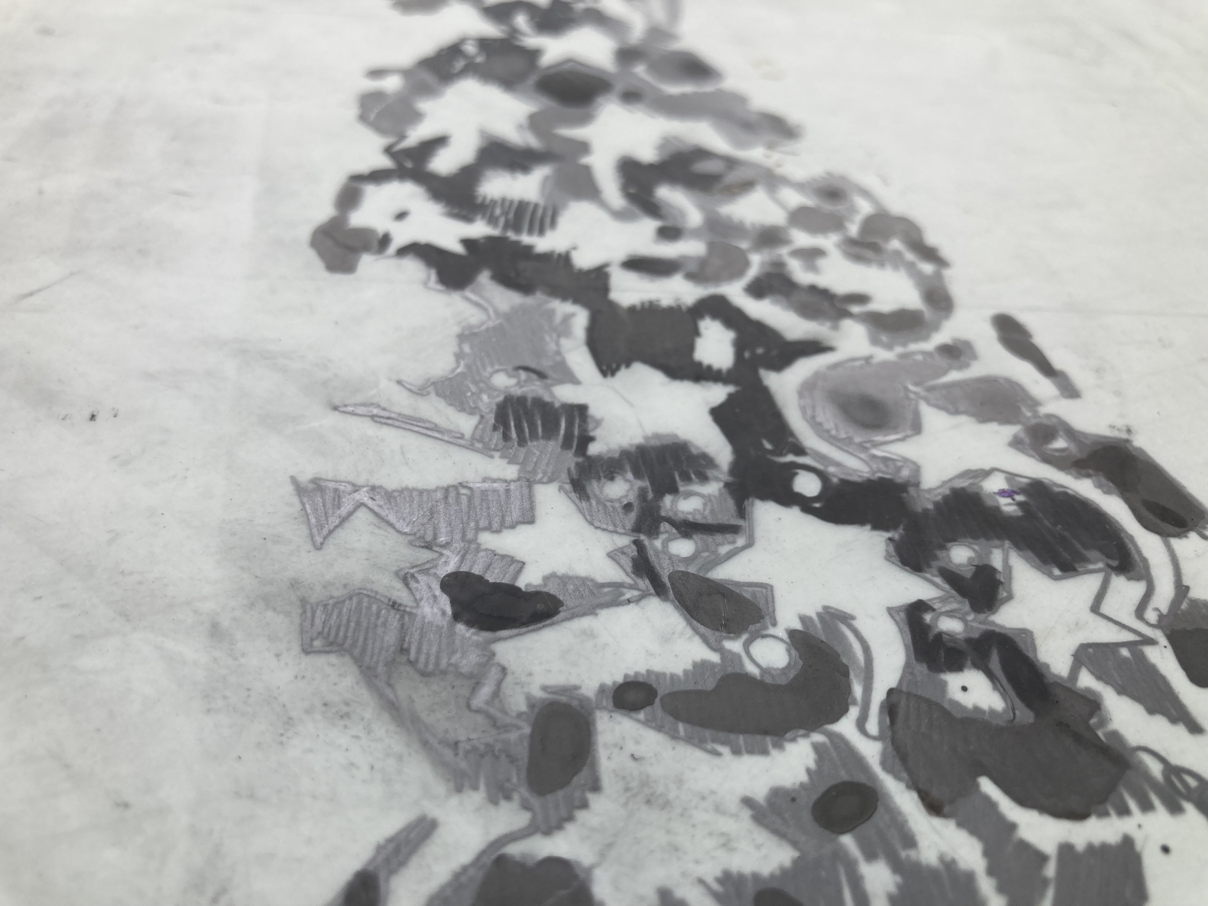
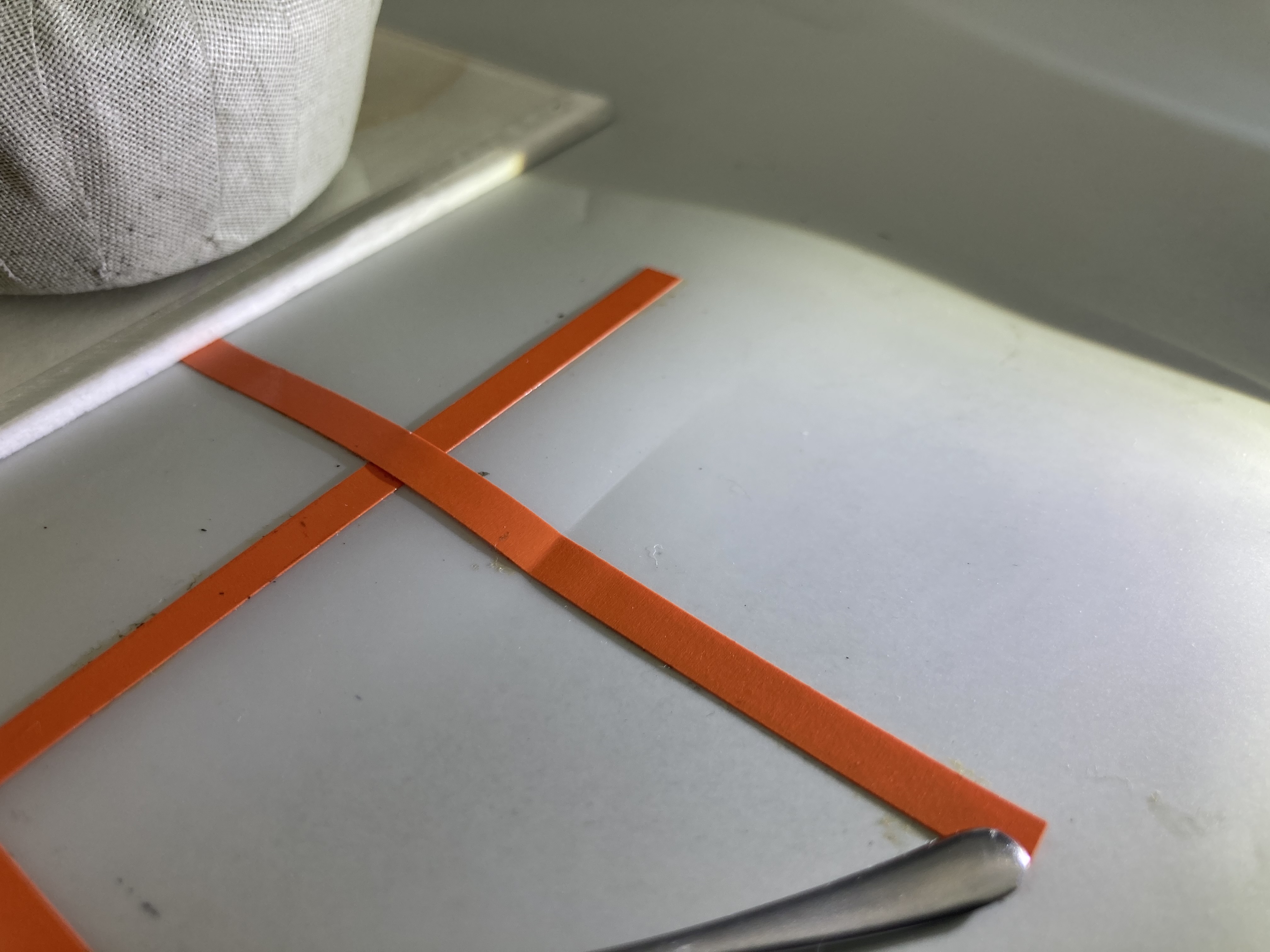
The plastic reinforcements and orange strips were identified as poly(vinyl chloride), often referred to as PVC. PVC is considered one of the most at-risk plastics in museum collections, because it degrades quicky in comparison to other plastics, such as those mentioned above. Some PVC includes plasticizers, which are added to make the plastic more flexible. The loss of plasticizers is one of the early degradation processes for PVC. They leach out of the plastic, forming droplets of liquid on the surface. This process damages the materials around it and leaves the plastic brittle. Fortunately, the PVC that Delsarte used does not have any plasticizers.

Polyisoprene, a form of rubber, was identified in the adhesive used to attach the orange strips and color swatches to the separations. Rubber is another of the most at-risk plastics in museum collections. It degrades by reacting with oxygen in the air, causing it to become thin and to crack. The same is true of rubber-based adhesives, which eventually fail because of degradation.

Condition and Treatment

Because these color separations were working tools, it is important to account for the evidence of use when assessing the condition and proposing conservation treatment. There are stains, creases, and marks that might be considered typical condition concerns for other works of art, but in this case, these features speak to how Delsarte and the printers at Brandywine worked and actively used these materials.

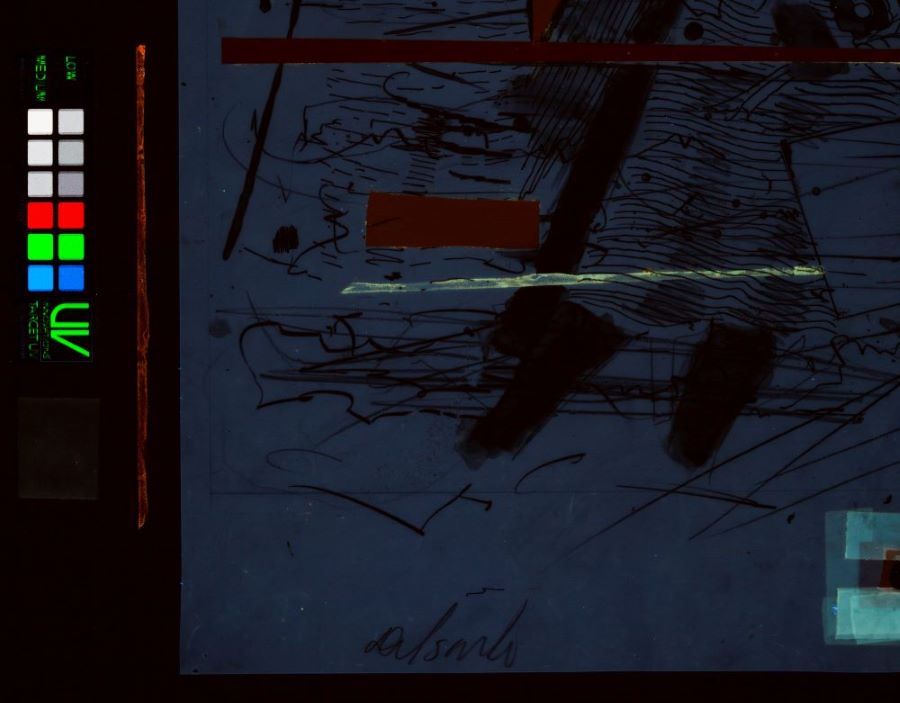
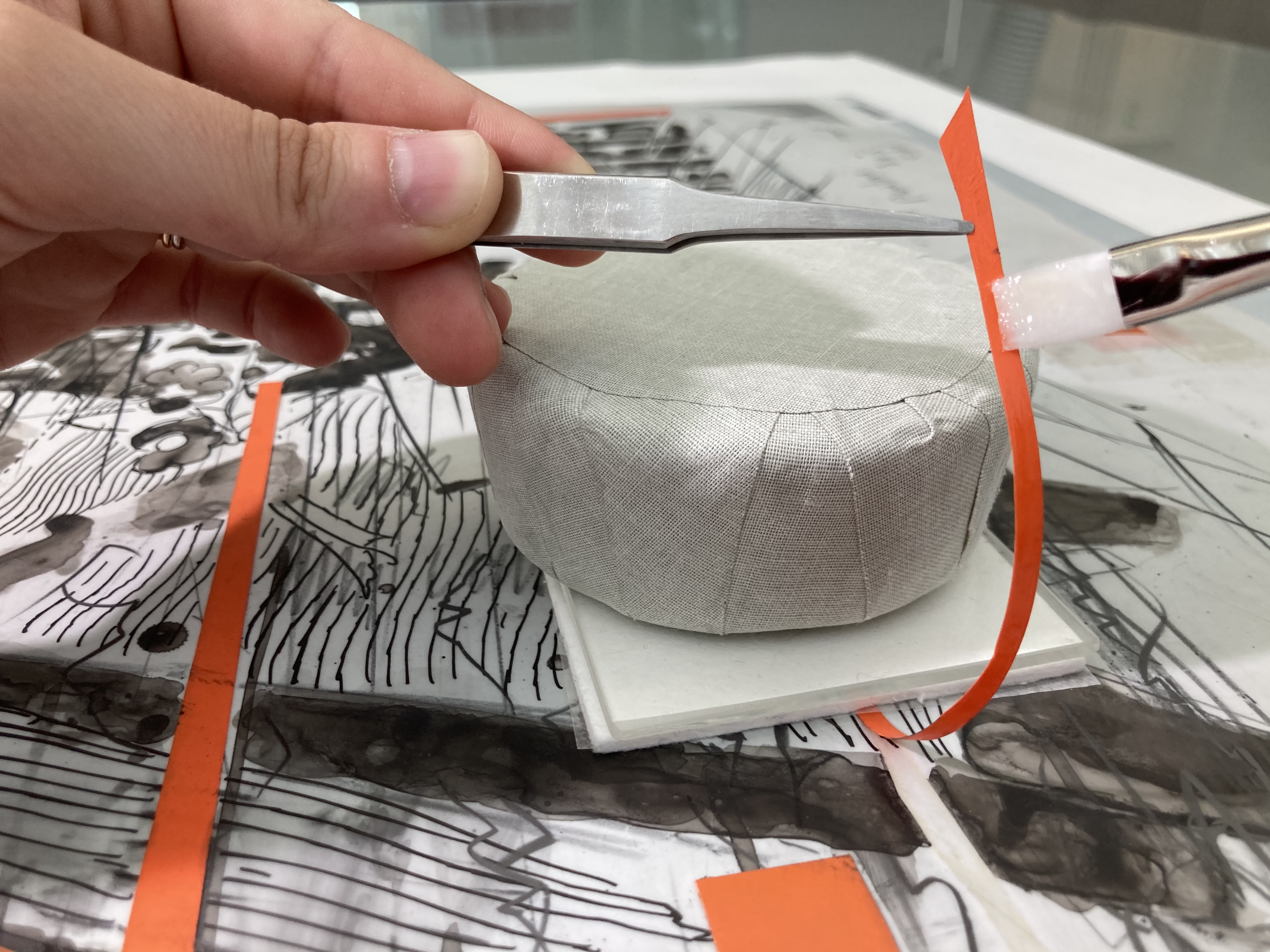
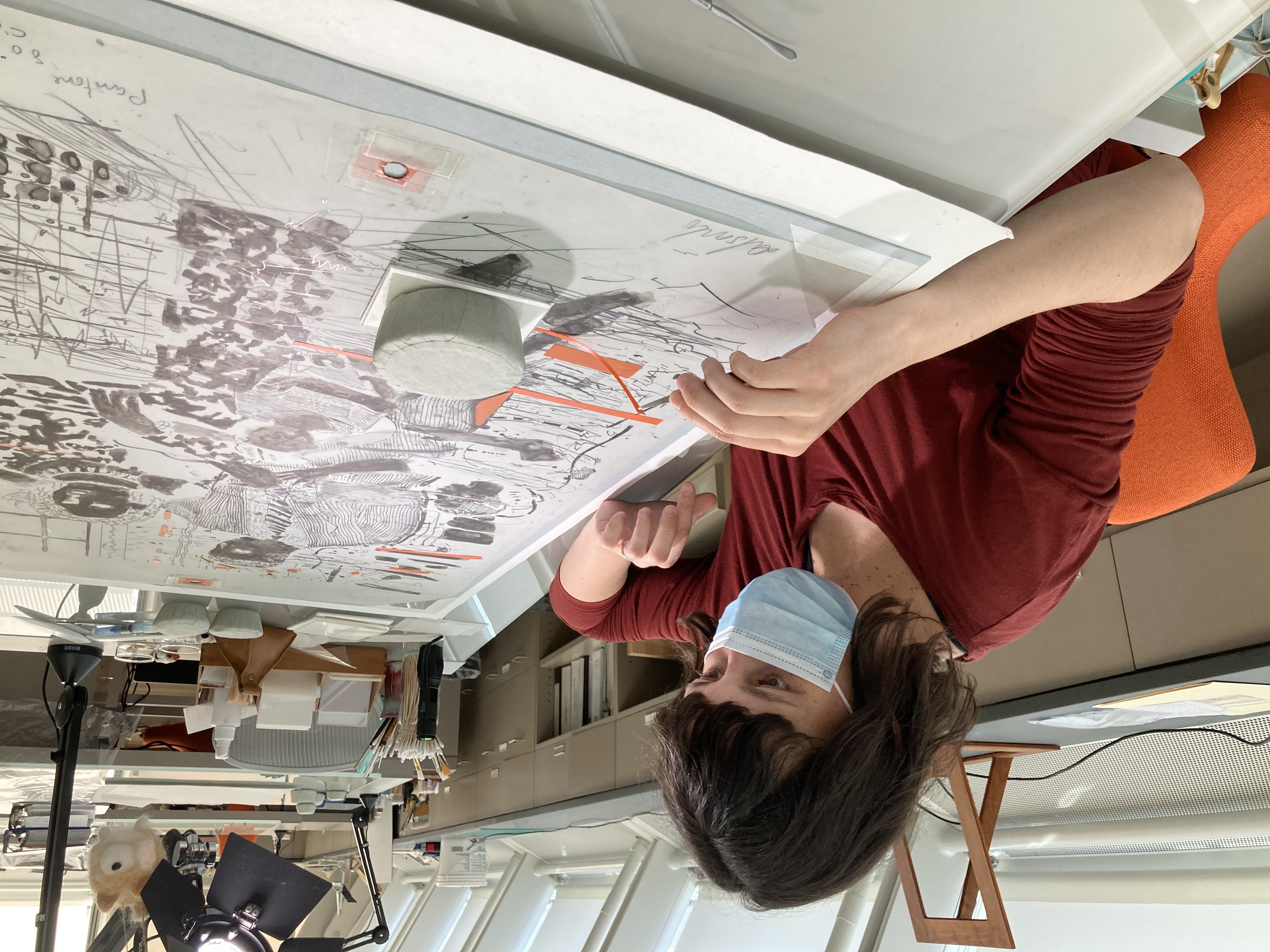
The rubber-based adhesive (likely a rubber cement) that Delsarte used to glue down the orange plastic strips in 1995 had embrittled, which led to its weakening and ultimately the lifting and detachment of some of the strips. Since these components were critical to the original functionality of the color separations, it was essential to reattach them in the proper location.

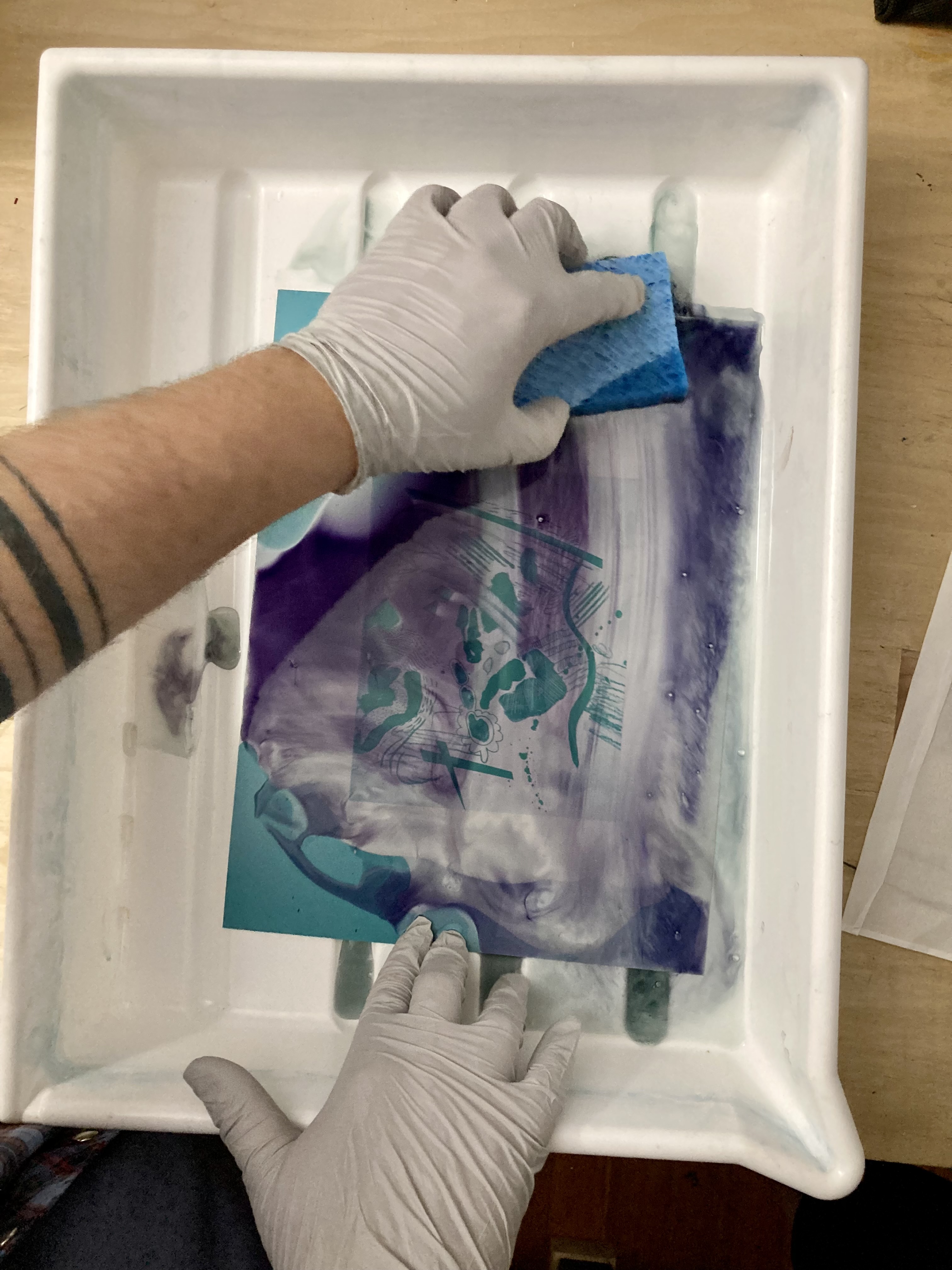
Three methods were used to find the original locations of the detached strips. The first technique was examining the Mylar sheets under ultraviolet (UV) illumination. Different materials fluoresce differently under UV, and in this case, the remains of the rubber-based adhesive fluoresced a bright yellow. Spotting fluorescent adhesive that matched the shape of the detached strips was a very quick and helpful way to find where the plastic strips belonged.

The second technique was matching any stains, creases, or marks on both the Mylar sheet and the plastic strips. In the example below, a crease occurred after Delsarte had attached the strip, and it can be seen in both plastic layers. Aligning the crease allowed for very precise placement of the plastic strip.

The third technique was closely looking at the final print to confirm that the areas where strips were to be reattached were, in fact, shot onto the photolithographic plate and printed in the final image. In the example below, the solid black band at the right of the print corresponds to the orange strip that was reattached to the color separation during treatment.

To reattach the lifting and detached strips, a synthetic adhesive was selected that adheres well to plastics, has good aging properties, and is easily reversible with water. The adhesive was applied with a brush, and weights were used to keep the strips precisely positioned and to provide good contact between the plastics as the adhesive dried.

Preservation and Storage

Because all plastics are light sensitive, one of the best ways to extend the life of a plastic is to limit light exposure. It is recommended that plastics are displayed for a maximum of four months, and for every month that a plastic is on display, it must spend one year off view in storage. Some plastics, such as PVC, benefit from storage at cooler temperatures, because this will slow down the rate of degradation. However, Delsarte’s separations contain a mixture of plastics and adhesives, all of which will react differently to a reduction in temperature (adhesives may become brittle and fail, for instance). Taking all components of the objects into consideration, the decision was made to keep the separations in standard storage conditions when not on view. They will be regularly monitored for any changes in condition over time.

Although they are stored away in darkness when not on view, we encourage visitors to request to see these works in the Art Study Center. Adam Baker, senior conservation technician, has constructed a custom box with handling boards for each separation so that visitors, students, and researchers can easily access, look closely at, and learn from these materials. The Harvard Art Museums have a long history of investigating artist’s materials and techniques and promoting object-based learning by teaching directly with works of art. Understanding how Delsarte developed his photolithograph through these 12 color separations offers a deeper understanding of how the artist worked.  


Christina Taylor is assistant paper conservator and Georgina Rayner is associate conservation scientist in the Straus Center for Conservation and Technical Studies at the Harvard Art Museums.