Corita Kent’s bold, rainbow-hued brushstrokes on the iconic National Grid (formerly Boston Gas) tank are as eye-catching today as when they were first applied in 1971. With its vivid palette and transformative impact on a utilitarian object, the tank design is just one of the artist’s many striking works of pop art. However, discussion of Kent’s extraordinary life—she was a Roman Catholic nun who lived, studied, and taught art at the Immaculate Heart of Mary College in Los Angeles from 1936 to 1968—has tended to overshadow scholarly discussion of her work.
“Other writers have focused attention on her biography,” said curator Susan Dackerman, who has organized the upcoming special exhibition Corita Kent and the Language of Pop. “We wanted to put Kent in a broader cultural and art historical context to look specifically at the work: to show where it comes from and to consider the motivations behind it.”
The exhibition, which opens September 3, aims to highlight Kent’s critical place within the pop art movement of the 1960s. It will contain more than 60 of Kent’s screenprints, along with about the same number of works by her better-known contemporaries, including Andy Warhol, Ed Ruscha, and Roy Lichtenstein.
The exhibition takes 1962 as its jumping-off point. That year Kent and her students viewed the work of a practically unknown artist named Andy Warhol. His now-famous soup can prints, on view for the first time at Los Angeles’s Ferus Gallery, left a strong impression. After that, Kent said, “you saw everything like Warhol.”
Another key influence for Kent during this time was the promised modernization of Catholicism being deliberated by the Second Vatican Council, or Vatican II. The Church advocated, among other changes to traditional liturgy, conducting of Mass in the local, vernacular language. Kent, like her pop art contemporaries, simultaneously turned to vernacular texts for inclusion in her prints, drawing from such colloquial sources as product slogans, street signs, and Beatles lyrics.
Her 1964 print the juiciest tomato of all reflects “the intersection of the ambitions of Vatican II and the strategies of pop art,” Dackerman said, pointing out that the work’s title comes from an advertising jingle for Del Monte tomato sauce. In the print, the Virgin Mary is provocatively referred to as “the juiciest tomato.” The tomato symbolism links Kent to both Warhol, who produced multiple works focused on tomato products in the early ’60s, and the Church’s goal of making the divine more relevant to everyday life.
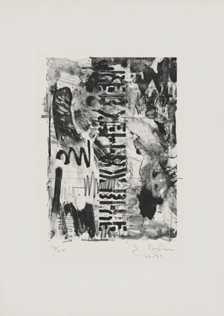
Kent’s prints are also in dialogue with the works of Jasper Johns. In Johns’s 1962 lithograph Red, Yellow, Blue, those three words appear in black, rather than their respective colors. The artist “has effectively drained language of its original meaning,” Dackerman said. “And once you have divested words of their meaning, you can reinvest them with other meanings—which is what Corita does in prints like the juiciest tomato.”
Kent’s use of intense, almost dizzying, color combinations—as in her green, orange, and pink handle with care (1967)—makes much of her work feel at home alongside the prints by artists such as Josef Albers. “For decades, Albers had been working on the relationship between colors and how we perceive them,” Dackerman said. “He created arrangements of colors that both jump off the page and recede into it. Kent was very much aware of the visual effects that could be created with color, and so as early as 1964 and ’65, she began printing with vibrant fluorescent inks.”
Despite these shared strategies, Kent has rarely been placed in the same company as artists like Albers, Johns, Warhol, Ruscha, and Lichtenstein.
Corita Kent and the Language of Pop, on the other hand, won’t shy away from asserting Kent’s role as an innovator in the artistic and cultural movements of her day. It will be Kent’s time to shine.
Corita Kent and the Language of Pop is supported in part by an award from the National Endowment for the Arts and major corporate support from National Grid.


