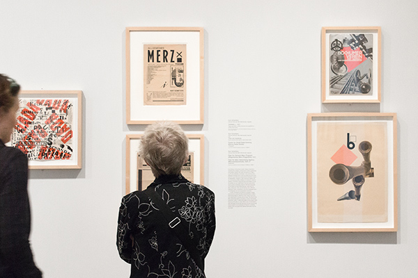
If you have strong feelings about typefaces or think critically about contemporary advertising, you’ll connect with a new temporary installation at the Harvard Art Museums about graphic design in Germany between the wars. The Ring: Art and Commerce, Kurt Schwitters and Colleagues—Selections from the Merrill C. Berman Collection showcases works from an international group of a dozen avant-garde artists, architects, and designers at the forefront of a new movement during the Weimar period. Robert Wiesenberger, the 2014–16 Stefan Engelhorn Curatorial Fellow in the Busch-Reisinger Museum, organized the installation.
Calling themselves The Ring of New Advertising/Publicity Designers (“neue Werbegestalter”), these artists produced drawings and prints that would hardly seem out of place among today’s billboards or periodicals. Design-minded visitors to the installation might be struck, for instance, by the contemporary feel of Walter Dexel’s 1929 poster for a photography exhibition, which features the mirrored and reversed words Fotographie der Gegenwart (Photography of the Present) in sans serif lettering. Like other members of the Ring, Dexel prioritized clarity of communication over so-called “beauty,” and maintained that typographic variables, such as text size and weight, could provide endless visual opportunities.
That interest in the power and possibilities of graphic communication was integral to the ethos of The Ring, as was the concept of the “New Typography.” Led by Kurt Schwitters, the group embraced modern design principles such as asymmetrical composition and the utilization of negative space, as well as sans serif type, photography, and photomontage—in stark contrast to traditional approaches.
The two-part installation, comprised of more than two dozen works on loan from the Merrill C. Berman Collection, provides insights about both the New Typography and The Ring’s members, including Jan Tschichold, Max Burchartz, Piet Zwart, Walter Dexel, and Willi Baumeister. To complement the works on view (the second part of the installation is on display now), Wiesenberger is leading an Art Study Center Seminar on November 4, in which participants will examine drawings, prints, and posters by The Ring’s founding members.
Revolution in Design
The work of these figures helped lay the foundation for the transformation of graphic design into a professional creative field. They collaborated and communicated freely and frequently, despite their geographic distances and diverse backgrounds (from Dada to constructivism, and advertising to agitprop). Through their work, they developed a sophisticated discourse around the relationship between art and design and the conditions of modern urban life and commerce.
Language and text were integrated into many pieces using standardized, unembellished typefaces. The first part of the installation began with an untitled collage (c. 1922) by Schwitters, who is best known as a Dada artist and poet. One of his many works created under the banner of “Merz” (borrowed from the word Kommerz [commerce]), the collage recycles printed artifacts from consumer culture, including part of the word Kakao (cocoa), in a liberation of language and concept.
Schwitters has received renewed attention due to the 100th anniversary of the Dada movement. But the New Typography “is a lesser-known side of his production that is complex and contradictory, and yet was very important to the artist himself,” said Wiesenberger.
The Ring’s members, most of whom trained as painters rather than designers, professed an expertise in capturing and controlling attention. “How they used this power—whether for culture, commerce, or politics—varied considerably,” Wiesenberger said.
Ring members employed the New Typography in everything from periodicals to advertisements to political materials. Their efforts to spread this approach were largely successful and long-lasting; the New Typography’s legacy is apparent today in the popularity of period typefaces like Futura, for instance. “The modernist impulse to strip down, mechanize, and modularize type was meant to make words look new,” said Zak Jensen, the Harvard Art Museums’ design manager, who recently co-led a gallery talk with Wiesenberger about the movement. “Ironically, many of the sans serif descendants of their work are now widely familiar and accepted as default typefaces.”
Mass Medium
Beyond advancing graphic design, The Ring also built a network in which practitioners exchanged information, cited and appropriated one another’s work, and cycled influences between their own art and design practices. A 1929 advertisement for heavy industry by the constructivist artist Max Burchartz, for instance, clearly borrows elements from his art practice, and vice versa.
Further, the New Typography claimed a genealogical connection to Dadaist and constructivist tendencies in art and to modernist architecture, represented by figures like Walter Gropius and Le Corbusier. It was in dialogue with—both employing and promoting—new developments in photography and film. Essentially, Wiesenberger said, “the New Typography underwrote the different messages of modernism at this moment.”
The Ring mounted more than 20 exhibitions across Europe, featuring like-minded “guests” such as El Lissitzky, John Heartfield, and Max Bill, as well as Bauhaus masters Herbert Bayer, László Moholy-Nagy, and Joost Schmidt. “For all these figures, graphic design was not an ancillary activity, but part of an effort to revolutionize visual communication and influence mass culture on the broadest possible scale,” Wiesenberger said.
The installation is located in close proximity to the work of founding Ring member Willi Baumeister, and Ring “guests” Lissitzky and Moholy-Nagy. Many of these artists were also important figures in the Bauhaus, which was active during the years of Germany’s Weimar Republic (1919–33). (The Ring was active from 1927 to 1931, after which time rising conservativism began to stifle modernist impulses.)
The works on loan “complement the works of Bauhaus and other avant-garde artists in this gallery, who were also active in typographic design,” said Wiesenberger. While the installation provides context to and opens up a new dialogue with objects from the museums’ formidable Bauhaus collections (and vice versa), it also performs another vital function: it highlights the origins of graphic design as a discipline and a mass medium. As visitors will quickly realize, today’s visual landscape owes much to this significant movement and group of innovators.
In early 2019, the Harvard Art Museums will present an exhibition titled Bauhaus and Harvard, to mark the centennial of the founding of the influential German school.


